Brand
The Catalytic brand is an important, but never dominant, element of the user experience. Our goal is to have the Catalytic brand identity be synonomous with getting things done. Therefore we use the brand very sparingly and minimally – never the largest or most dominate element on screen.
Logo
For public facing products the full logo should be used. The logo should be only be used on white or light backgrounds.
-
Light Wordmark Logo – Use only on white or light backgrounds -
One Color Wordmark Logo – Use only on white or light backgrounds -
Dark Workmark Logo – Use only on white or light backgrounds
App Logos
Within our apps, the Catalytic logo is shown without the word mark. The colored logo is shown on white or light backgrounds. The black and white logo is shown on dark backgrounds.
The colored logo should not be used on dark backgrounds.
-
Light Logo – Use only on white or light backgrounds -
One Color Logo -
Dark Logo – Use only on dark backgrounds.
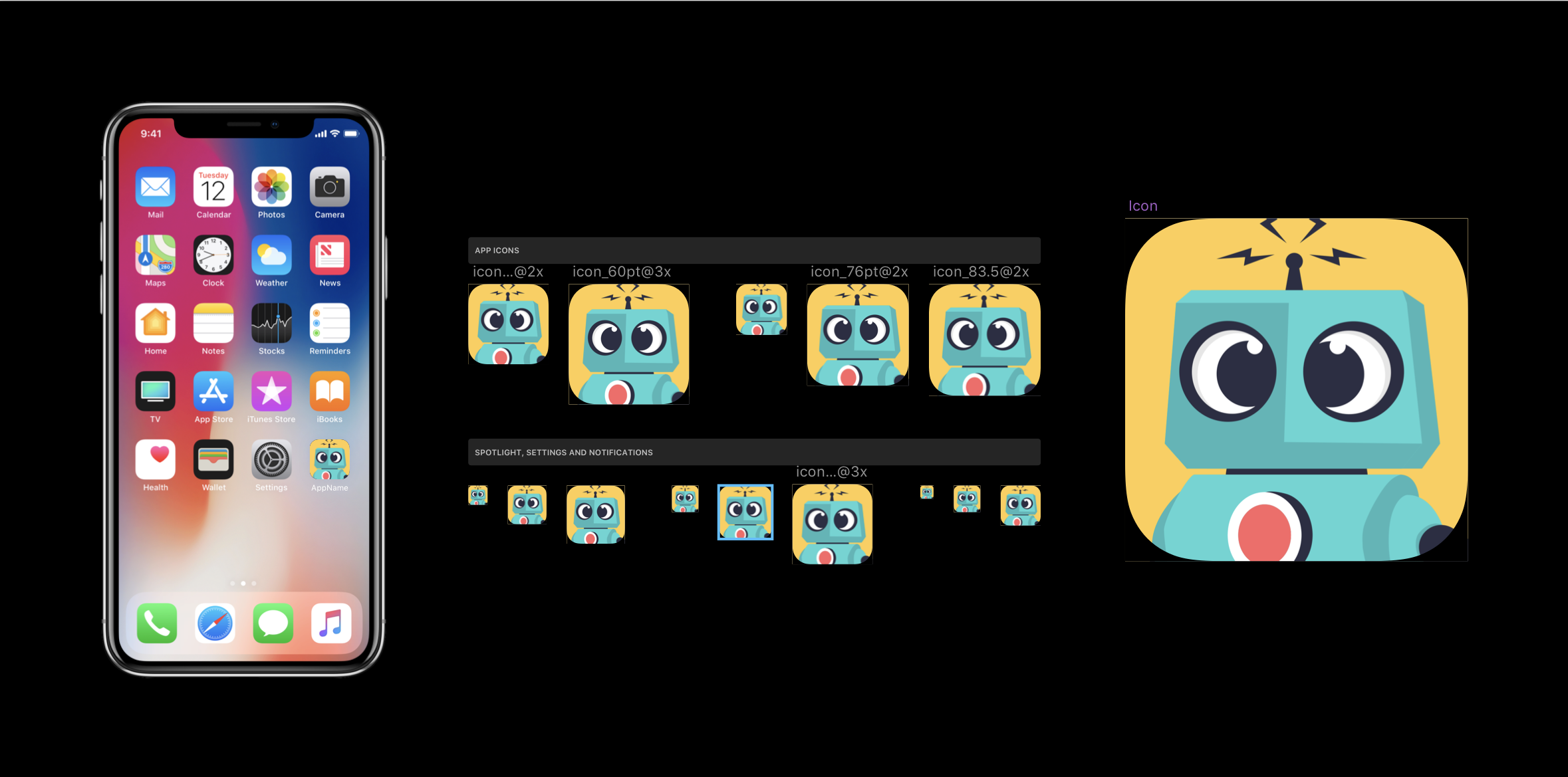
App Icons
The app icon is for use with the mobile app and for touch-icon metatag.
Tasks
- Finalize App Icon
-

Draft iOS Icon Template
Favicons
The Favicon is seen in the browser url bar and browser tab.
Tasks
- Create Favicon